
>
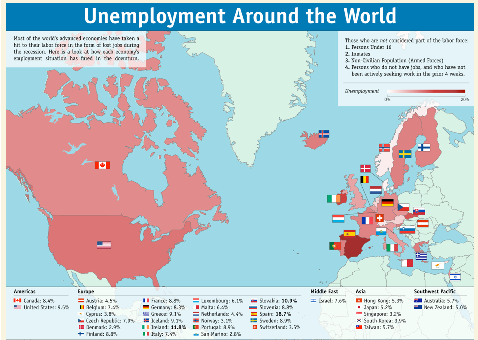
Visual Economics today treats us to a truly meaningless graphic, purporting to represent “how each country’s employment situation has fared in the downturn”
Bollocks.
It shows that everyone’s unemployment rate is pretty much the same (with the exception of Spain), and everything’s pretty much in the pink.
Of course, having been suckled on PowerPoint, the people at Visual Economics are blithely unaware of the fact that they’re not even displaying (albeit appallingly) what they claim to be doing.
Which is the impact of the downturn.
Which would be a chart showing a year-on-year INCREASE in unemployment.
No?
Tufte’s The Visual Display of Quantitative Information would be a good place to start

